
Somehow, someone wrote a song that told me exactly what I wanted to hear today.
12.11.2009


3.16.2009
Nothing Nice to Say by Mitch Clem

 Easiest review ever.
 Well, maybe that's a little too harsh. The art eventually moves towards solidity after starting rough. The jokes come just often enough to motivate continued reading, and the characters are clearly, if thinly, defined. The main thing that I can offer in the way of buying advice is this: If you recognize the reference on the cover (pictured here), and the names Avail, Maximum Rock N Roll, Kid Dynamite, Joe and Monkey, and Questionable Content mean anything to you, you will probably enjoy this book (or more likely already own it). This collection of comics originated on the web, and works best while filling its niche.
3.14.2009
Schulz and Peanuts: A Biography by David Michaelis

Note: The following text was written starting in January 2008, when I had finished the book discussed here. I picked up the draft and finished it in March 2009. The copy of the book that I read was an advance preview, and while I think there were few revisions before publication, it should be noted.
I had heard about some static about this book when I was a quarter the way through reading it and I decided that I didn't really need to read about it. I knew I was going to finish the book, so I thought I might as well finish it while judging it solely on its merits. When I finished the book, and I thought, "well, I had better write the review of it first, then I can follow up on the scuttlebutt." So here's my take, before I read the talkback:
The book takes an interesting theory — Schulz wrote his own autobiography in fifty years of strips — and takes it to a logical, if impossible to prove, conclusion. Michaelis writes his prose, then inserts Peanuts strips to support his narrative. He does a fine job, but it begs the question of how often he had to bend his narrative to synchronize with the strip at hand.
I frequently read non-fiction, but almost never read single-focus biographies. It may be that I don't understand the expectations of the form, but it seems that the best the author can do is to research his subject fully and make his best guesses about the meaning of the subject's life. Michaelis seems to have done his legwork, finding stories and anecdotes, recorded and retold, from those closest to Schulz. I am sure that the story he builds focuses on those tales which best support his hypothesis, but any reader should always assume that a story is told from the perspective of the teller, even a biography. The greatest support I found for the telling of this tale is the samples offered and cross referenced from the 50 years of comic strips that Schulz created.
Michaelis provides numerous reprints of strips from Peanuts run, inserting them directly into the text to provide illumination to the stories, theories, and facts laid out in the writing. As a reader who firmly believes that an artist who creates a lasting work of art (something that I credit Charles Schulz with doing), I agree that the tales of Charlie Brown and company can offer illumination as to the inner life and personality of Charles Schulz.
The greatest testament I can offer as to the author's evenhandedness is to say that he offers a reading of a life, not a definition of one. Michaelis certainly offers his perspective on the life of the legendary cartoonist, but never reaches hyperbole that dictates that this is the only perspective. This might say more about your reader, since I read journalism with the same skepticism, and it serves me well. Charles Schulz is an artist who has a significant amount of literature focusing on his life, and I think that this book offers a unique, insightful perspective to add to the expanding light which illuminates his life.
Schulz and Peanuts: A Biography by David Michaelis

3.29.2007
Jay Kennedy, Rest In Peace
I have been to San Diego Comic Con every year for the past 18 years, and I sold comic books for most of those. In a business like comic book retailing, at an event like San Diego, you meet people that you tend to run into year after year, and if you share a common interest, you tend to continue the same conversation year after year. There are many such people that I see in San Diego, but there are few that I enjoyed speaking with as much as Jay Kennedy.
I first spoke to him about seven or eight years ago, and while I ran into him at a few other comic shows, he and I spoke at every San Diego in recent memory. Our conversation started because of a common interest, independent and underground comic books, and when I realized that I had read and referred to his book regularly, and each year we picked up where we left off until it the conversation continued down other avenues, both personal and professional.
The people that you see, many of them come and go, and you rarely know why the leave or where they go. Many of them you never learn about, and many of them you don't even remember. Jay happened to be famous enough that I heard about his death the day after it happened (on The Beat), and he had made enough of an impression on me that I was struck with sadness. People don't bother writing reminiscences like this if they don't have anything nice to say, and here I have nothing but nice things to say.
Jay was one of the very nicest people that I met thanks to San Diego, and talking with him about comics (books or strips) was always a conversation I looked forward to, and this summer won't be the same without the chance to see him.
(If you would like to read more about Jay, I recommed this or this, care of Tom Spurgeon)
I first spoke to him about seven or eight years ago, and while I ran into him at a few other comic shows, he and I spoke at every San Diego in recent memory. Our conversation started because of a common interest, independent and underground comic books, and when I realized that I had read and referred to his book regularly, and each year we picked up where we left off until it the conversation continued down other avenues, both personal and professional.
The people that you see, many of them come and go, and you rarely know why the leave or where they go. Many of them you never learn about, and many of them you don't even remember. Jay happened to be famous enough that I heard about his death the day after it happened (on The Beat), and he had made enough of an impression on me that I was struck with sadness. People don't bother writing reminiscences like this if they don't have anything nice to say, and here I have nothing but nice things to say.
Jay was one of the very nicest people that I met thanks to San Diego, and talking with him about comics (books or strips) was always a conversation I looked forward to, and this summer won't be the same without the chance to see him.
(If you would like to read more about Jay, I recommed this or this, care of Tom Spurgeon)
10.20.2006
Dr. Strange: Oath 1 by Brian K. Vaughan and Marcos Martin

Well...
I've always hated the idea of Dr. Strange. Anything having to do with "the Mystic Arts" or spellcasting or magical worlds or other dimensions or blah blah blah has always turned me off.
But...
I've always enjoyed the creators that work on Dr. Strange. Steve Ditko, Bill Everett, Marie Severin, Gene Colan, and even the recent Defenders series by DeMatteis, Giffen and Maguire.
So...
Here's a new series of a character that I don't like written and drawn by creators that I do like. I enjoy Marcos Martin's art. He has a clean style that focuses on design and layout and never relies on flashy rendering. He has a confident brush line and seems to get very lucky with confident and attractive coloring work. And I've discussed my respect and admiration for Brian K. Vaughan here, here and here.
Anyhow...
I picked up the first issue of the new Dr. Strange mini-series, and except for a tiny bit of that mumbo-jumbo that I dislike so much, I think it's great. The art is simple and confident, with Martin's strong brush backed up by crisp, straightforward coloring that his art deserves. The plot is simple so far, but removed enough from the mystical silliness that I wasn't punted out of suspension of disbelief-ville. I look forward to the rest of the series, and I'm interested enough to wade through the spellcasting and astral projecting that is sure to arrive.
And...
Aren't you glad that not every mainstream comic has to have those inane narrative segue captions.
10.04.2006
What Are You Hiding?
I saw this at Target and I couldn't pass it up.

Every decent human being under the age of 40 knows that wearing a mustache is a sign of the dastardly deeds the wearer is capable of, that's why they named the villainous cartoon character as such. This fact is supported by the costumes that this kit suggests are possible. No decent human being would want to be known as any one of these characters. "The Hollywood"? Please, when was the last time any self-respecting actor would have worn that mustache non-ironically in public. 40 years ago? And even then?
The problem with the ironic mustache is that it's not really ironic. Only an asshole would wear an ironic mustache. A generation ago they were the ones who would have worn it proudly without irony anyway.
By the way, I would add one to the list for the girls who feel left out. The Frida.
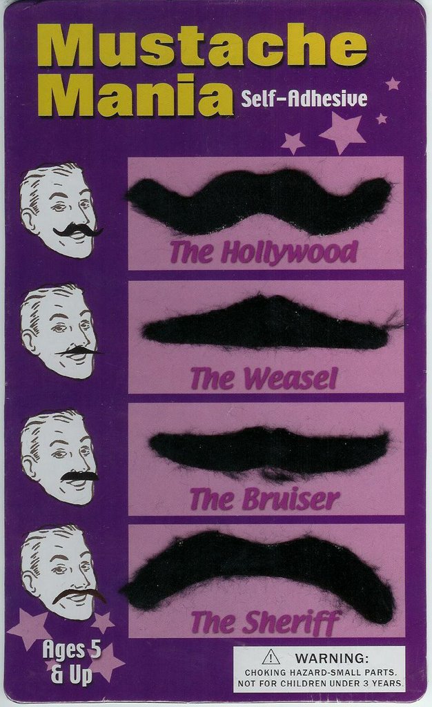
Every decent human being under the age of 40 knows that wearing a mustache is a sign of the dastardly deeds the wearer is capable of, that's why they named the villainous cartoon character as such. This fact is supported by the costumes that this kit suggests are possible. No decent human being would want to be known as any one of these characters. "The Hollywood"? Please, when was the last time any self-respecting actor would have worn that mustache non-ironically in public. 40 years ago? And even then?
The problem with the ironic mustache is that it's not really ironic. Only an asshole would wear an ironic mustache. A generation ago they were the ones who would have worn it proudly without irony anyway.
By the way, I would add one to the list for the girls who feel left out. The Frida.
9.29.2006
Criminal 1 by Ed Brubaker and Sean Phillips
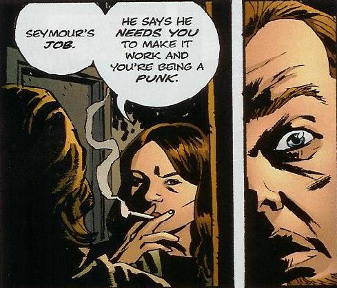
There are many comics these days that can be categorized as crime comics, but most of them include another genre convention. They involve super-heroes or former super-heroes, they investigate something supernatural or fantastic, or in the most famous case, Sin City, they are set in a world that never seems real, but never decides on how much unreality it should include. There are some traditional crime comics, set in an approximation of the real world, that eschew the fantasy that most mainstream comics, crime-related or not, participate in. This series appears to be one of those.
Many of Brubaker's past series have used the trappings of the crime genre in telling their stories: Sleeper, Daredevil, Catwoman, and Gotham Central to name the most popular. Some of his other series featured characters who were criminals, such as Deadenders and Lowlife. This book looks to live up to its title and avoid all the distractions from other genres. Straight-up criminals committing straight-up crime.
The first issue provides a promising set up for the series. We're introduced to our main character, Leo, and given just enough background to sympathize with this hardened criminal. The real joy here is the prose itself. Hardboiled without being overdone, Leo as narrator avoids the Mickey Spillane schtick that Frank Miller does so well and each supporting character is given a distinct voice in the the few pages that they appear. The foundation for the plot is laid, and my hope is that Brubaker can hold it together until the pay-off. A story like this can sometimes be masterful for the first two acts, then fall apart with a weak ending. I'm hooked from this issue though, and trust that my investment will be rewarded.
The storytelling is fluid, thanks to the comfortable rapport that Phillips and Brubaker have built up over their last collaboration, Sleeper, and they know when to get out of each other's way. In an issue that is 90% talking heads, Phillips manages to create an easy flow to the pages and keeps the reader in tune with the right amount of scenery changes and his unique rendering style. A Phillips character looks like a Phillips character, but he manages to keep them all distinct with his art as well. The issue carries a gorgeous cover, blood red and chunky orange, and the interiors are held together by the heavy blacks that allow Phillips to be good and fast. Phillips is a craftsman to be sure, but his pages hold the love of art and the search for truth.
9.26.2006
Cloud Boy by Rhode Montijo - An Appreciation
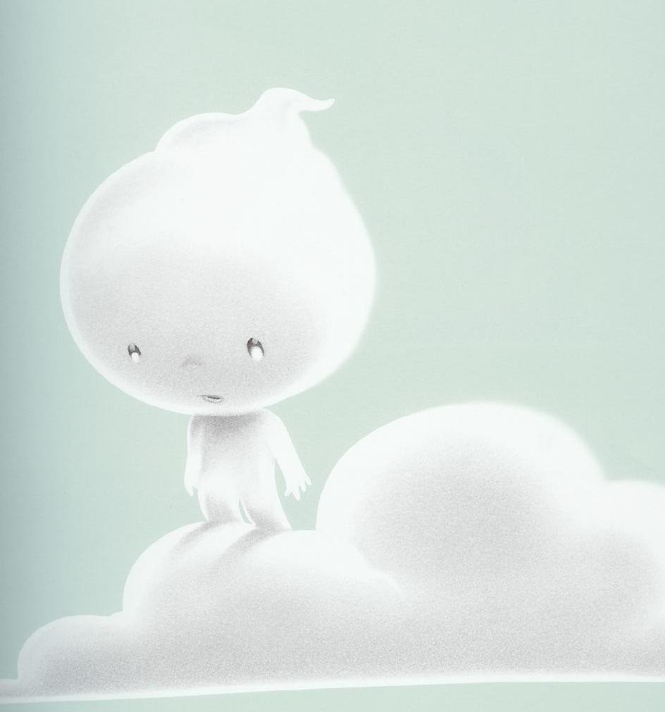
This is a new children's book from an artist that has drawn comics, works as an illustrator, but is probably most famous online for his collaborative effort, Happy Tree Friends. I picked this book up at SDCC, but I admit that I probably wouldn't have if I didn't have a nine month old daughter. My book "collection" before my daughter was born did contain a few books that are conisidered children's books, but they were few and far between. This book, however, I would recommend to anyone who is a fan of illustrated books at all.
The story is as simple as could be, in fact it's perfectly simple, a story pared down to poetry, yet the idea is so expansive that it sets the imagination free, allowing for you to carry it with you long after you put down the book. The text is carved down to deliver the essence without losing the rhythm that a children's book needs, being so commonly read aloud. With a minimum of effort, the script allows you to feel confident that you are reading the words with the conviction of the greatest of Shakespearean actors, no mean feat for a story that consists, textwise, of only 123 words. This expressiveness, the appealing sound the words create in the speaker's mouth, are the first thing that make this book the favorite of my daughter. She need only hear the first line of the book, "High up in the sky lived a lonely little cloud boy," for a smile to cross her face.
It's the idea behind the book that makes it a favorite of mine. As a child, my parents allowed me access to many of the great children's book of the last century, created by those names familiar to us all, Silverstein, Seuss, Rey, Kipling, De Brunhoff, and others. The very best of these books had lessons that adhered to my brain and remain with me today. Seuss's lessons of inclusion, pride, and achievement, Rey's lessons of adventure, Silverstein's lessons of love and generosity, these are the types of books that one can be proud to share with their children. I hope that my daughter finds that her family encourages creativity and individuality, and I can see this book planting those ideas in her someday. Montijo makes the story so easy to latch on to that the beauty is suffused through the repeated readings.
The illustrations are amazing as well, the iconic appearance of the title character makes it easy to identify and empathize with. The light and airy pictures expand the freedom of the idea, creating the feeling that all the pages take place over a giant tableau, each one being a small snapshot frozen in time, but free in space. This freedom creates a peaceful feeling in the reader, who when reading to others is of course the narrator, and that peace spreads out to the listener.
It won't be too much longer before the words become an imprint in my memory, and the story will be able to unfold in the world whenever I want it to, perhaps under the very clouds that inspired the author to tell this wonderful tale, and it will allow me to use the very creativity that the author hopes to inspire.
9.15.2006
Pride of Baghdad by Brian K. Vaughan and Niko Henrichon
 The precedent set for anthropomorphic comic books or cartoons is that the animals will, in some way, be illustrated to highlight human emotions and enable a connection with the reader that wouldn't be present from a realistic drawing. Whether it's simplifying the character to a cartoon abstraction as Gary Larson would in The Far Side, or adding human characteristics such as emotive eyebrows as you would find in Disney's lions. It is to the credit of Vaughan and Henrichon that they rely on neither of these.
The art is representational throughout. Henrichon's style is one of the most realistic that you will find in comics. This services the story told as its main characters a small group of lions, the titular Pride. We see the entire story over the shoulders of these lions, and the dialogue is where we get the emoting. Vaughan is capable and adept at deciding how the visual flow of the page should come, in fact he's one of the best out of the list of writer's who exclusively write, it's just that his command of the words allows him to let the art work on it's own rather than as a crutch to support the writing. Of course, great comics aren't made without the art complementing the words, but when trying to compose a story that uses formal play (lions who are in every way animal except for the thoughts they speak to one another in word ballons) it's important to not let the method become the message.
A story set in Iraq in 2003, while Baghdad was being bombed and occupied, is naturally going to be a divisive topic in a country where politics is the ultimate symbol of division. Vaughan mitigates this by keeping his proselytizing to himself. His one overt comment (the last line of the book) is kept covert enough by its careful wording. In this country we're so constantly reminded that artists are liberals and the military is conservative that it is difficult for me to avoid deciding the political stance of a comics author before I read a comic that references politics. And I've read enough Brian K. Vaughan comics to think of him as a liberal. This book, however, does a wonderful job of staying off the soapbox and simply telling a story. He infuses his animal characters with such humanity that I found myself as picturing them as humans rather than the cartoon delineations that we are all familiar with.
The story does feel a bit filled out, as though it could have been told in half as many pages, but Henrichon's art is so strong that it provides a visceral thrill when you take the story out of the occasion. Realistic, but with the immediacy of life drawing studies, he holds control of the page by covering all the bases in what would frequently be a team effort. Normally we would have a separate inker, or at least colorist on a DC comic, but Henrichon handles everything except lettering himself. It allows him to produce some pages with what looks like digital inking, some with what looks like scanned pencils, and others with traditional inks that are colored in the same rendered color as every other page in the book. He has enough control over his computer coloring that he can make pages that are rendered with different techniques flow together seamlessly.
While this book is not quite the masterwork I was hoping for (I believe that Vaughan will one day helm a short work that will match the quality of his outstanding longer works, Y the Last Man and Ex Machina), it is certainly a proud (ugh) addition to my library.
9.13.2006
I Am Going To Be Small by Jeffrey Brown
 As I've said before, I like emo comics. I appreciate the earnestness of a guy writing "about cooking pasta alone on a rainy night", if he's writing the truth. The main drawback to emo comics is that they are never funny enough. These books are so busy taking everything so seriously that they forget how silly someone looks when they are in love. To pick on someone whose work I really enjoy, Craig Thompson is an example of a guy who is ripe for laughing at because he too seldom laughs at himself in his comics. Again, I enjoyed Blankets, and I think that Goodbye, Chunky Rice is a very good comic, but I think that Thompson will really hit his stride when he learns to inject his work with a little more humor.
Now Jeffrey Brown is a guy who broke out by doing some very earnest comics, Clumsy and Unlikely. The humor in those books was limited to inside jokes and cutesy moments. While making these twee little books, he was apparently also amusing himself with gag books. The title reviewed here is a mini-comic that he expanded for this "official" release through Top Shelf.
Brown can be very funny. His self-parody comic, Be A Man, exposes the id of the Jeffrey Brown character that is the protagonist of Clumsy, and it works perfectly at extracting laughs. It's much funnier than the parodies of his work that I've found in Krayon's Ego or Comic Book Apocalypse. He shows that he's capable of seeing the self-seriousness of his work, and tears it apart.
The book at hand, unfortunately, misses the mark more often than not. It might be that this book is the comic book equivalent of the deleted scenes portion of most DVDs. You watch these scenes, and most of the time you understand exactly why they were cut from the final film. The gags that this book was expanded to incorporate are on the same level. An occasional chuckle, but much more frequently limp jokes. The art is as strong as the last several books that Brown has released, and there are many panels that aren't very funny that are saved by the appearance of his drawing style for the reader familiar with his oeuvre. To see the same illustrations that portrayed such earnestness portray such silliness can have a positive cumulative effect, and he has an understated style that lends itself to the absurd, and makes palatable the jokes which only Brown or his friends could possibly understand.
There is an entire section at the back of the book that is devoted to an approximation of an indie comic gag strip with recurring characters. The problem is that the characters, all cutesy anthropomorphic of woodland animals are completely interchangeable, with no individual personality amounting to anything. In fact, the two female characters are illustrated with fur-covered breasts, just in case we forget that they are supposed to be the females. Each gag is set up as a generic joke, feeling like they were something that Brown thought was funny while writing his autobio books, but they weren't "true" enough to make it into those books. Each time the male characters, the bear or the bird, are talking, they do nothing to distinguish themselves from one another. The females, the bunny and the cat, are just as indistinct. It might be that Brown is intending for this to be another self-parody, turning himself and his relationships into gags, but if that is the case, Be A Man is the much more successful example.
9.10.2006
David Hahn

One of my favorite things about being a comics fan is that most of the creators that you follow are not out of reach. There are exceptions, of course: the dead, the recluses, the dickheads. For the most part they are available to their fans. I have had the great fortune to meet many of the legends of comic history over the years at comics conventions, and I kick myself for not approaching the few that I should have (Eisner in particular). In any case, one of my favorite reasons to go to the San Diego Comic Con each year is to meet a comics creator that I've never met before. I met several that I'd never heard of before, and a few that I was already a fan of, but had never seen in person.
One that I am a fan of, that I had the opportunity to meet for the first time was David Hahn. I made mention of him in relation to his most recent series, Bite Club, and he strolled up to the booth of the friend I was helping at the show. I noticed his name on his badge (once you start reading badges at a show like that, you'll never stop, you'd be amazed at who you could be talking to) and introduced myself. He was very gracious and humble and gave me directions to his table so that I could check out the work he had for sale at the show.
I finally got a chance to find his table a day or so later, and grabbed a copy of the sketchbook he had for sale (I sampled a page for the image above) as my friend grabbed several pages of art. This story is not meant to be a name-drop, just another example of the accessibility of artists in the medium that I remain such a fan of, and to bring up a specific example of an artist who was friendly, and that he is one of many.
9.09.2006
Local by Brian Wood and Ryan Kelly
 Maybe I'm just a sucker for emo comics.
Brian Wood is another guy that I never bothered to read. The early works I saw, like Channel Zero, never struck my fancy. I read Pounded, but it smacked of trying to hard. The blurbs that I read about Demo always sounded interesting, but whenever I grabbed the books themselves I was just kinda, "ehh", but now that I'm a Becky Cloonan convert as well it might be worth another shot. Local, though, looked good enough from the solicitation that I tried it out blind when it came out even though I didn't bother with DMZ or Supermarket.
I've enjoyed this series very much. The art is consistently strong. There are a few hinky panels here and there, but Ryan Kelly strikes a nice balance between his fast and loose brush and his tight layouts. He does a great job varying the shots -- even though it tends to be page after page of talking heads -- without ever giving the sense that he's cribbing from Wally Wood's "22 Panels." I look forward to more work from this artist and think that he might grow into a comics strong-man.
There is a self imposed stylistic decision to set each issue in a different North American city or community, and the series so far is mostly about one character, but each issue is told as a standalone as well. I'm not sure if that should be a selling point for a limited series, but if you're on the fence, any issue is a fine starting point and there's no need to go back to the first issue.
(Does anyone even buy comics anymore unless they know whether or not they're going to like it. And I don't mean first issues, would anyone out there just pick up the 6th issue of an ongoing series just to see if it fits their taste. I've got to imagine that most of you would either read an issue in the comic shop or read enough to know that you're going to buy the trade when it comes out.)
The stories do feel like they are building to the finish, and the supplemental material in this issue (6 is the most recent at the time of writing) says as much. Brian Wood admits that this stand alone story does contain some reference to previous issues, but I think that they are minor, and only add to the depth that Wood is trying to create. I will say this as warning: If you are turned off by the idea of a comic about a 20-something who is trying to find her way, stay away from this book.
Maybe I'm just a sucker for emo comics.
9.06.2006
Krayons Ego edited by Jesse Reklaw and Karen Sneider

This is an anthology of parodies of the well-respected indie comics anthology, Kramer's Ergot. Now, this has been done before. Kurt Wolfgang did it in Low Jinx #3, Ed Brubaker and Sam Henderson and others did it in Deceased Corpse, and Johnny Ryan performed his own version of it in the recently expanded Comic Book Holocaust. This comic and Low Jinx both went for the method of cartoonists (there is a list of contributors, but they are uncredited as far as who drew what) picking specific creators and doing stories in the style of the original, but parodying the content. As an example, see the above panel from the parody of Tom Gauld's one page musings on famous authors. In this series of one-pagers, comic creators like Sammy Harkham are treated to ridicule in an artistic style that very accurately apes Gauld's. A few other Ergot contributors are targeted, but then the conspirators move onto bigger and more famous subjects, seeking and destroying James Kochalka, Craig Thompson, publishers Top Shelf and AdHouse, and even parodying a parody by carving up Johnny Ryan.
Now I used a lot of non-commital synonyms for parody in that last paragraph, but the fact is, I love this shit. I very much enjoy nearly every creator that is satirized, and when the stories are brutally mean but still funny, I enjoy it nearly as much as reading the originals. I especially appreciate the fact that they take on creators that are so critically respected. Most people are willing to take potshots at Craig Thompson, but I thought Paper Rad and Mat Brinkman were unassailable. All the better, they are just as rough when it comes to these guys. It just goes to show that you can't successfully parody without a familiarity or a love for the source material.
The art in this book is surprisingly strong. As I mentioned above, individual stories are uncredited, but the artists listed do a fantastic job of aping their respective comics. Art is credited to Tom Neely, M. Campos, Clutch (link?), Josh Frankel, Sarah Oleksyk, Jesse Reklaw and Karen Sneider. I don't know who's responsible, but the artists in charge of the parodies of Tom Gauld, Craig Thompson and Jeffrey Brown perform an excellent job of facsimile. They get the art just right, and they tear apart the tropes that those artists (over)use. The James Kochalka, Paper Rad and John Porcellino swipes come close, but there are giveaways that cause you to see the hand of the parodist at work.
The writing is strong, and only occasionally do the stories fall into the very trap that they accuse Johnny Ryan of, namely falling back on sex, drug and shit jokes when they don't have a ninsightful target in mind. The rest of the time, though, the hits are accurate enough to make me wince for the recipient.
9.04.2006
Your New Religion Books one and II by Joe Sayers

When I first saw these mini comics I thought they were by Nicholas Gurewitch of Perry Bible Fellowship fame. The PBF is maybe my favorite online comic strip, given that I have no interest in video games and I can't relate to Achewood. So anyway, the surface similarities led me to connect this mini-comic with The PBF, and when I looked closer I realized that I had made a connection based on the title and a cursuory glance at the art, but upon inspection realized that this was a separate creation all together.


The books themselves are small in their sense of scale, both of them measuring 3.5 inches by 4.25 inches, and the guts are photocopied in black and white, but they also have some typical mini-comic upgrades, reflective foil covers and a stamp in issue one. Each book consists of 36 pages of single panel cartoons, all based on the title conceit being that they are tenets and features of "your new religion".
The books are funny. Drawn with simple moon-faced characters you see above, the gags range from goofy non-sequiturs ("Lick a cat for forgiveness") to inversions of traditional religious dogma ("Mandatory suicide for impure thoughts"). The art is confident and carries the appropriate amount of information, and nuanced with tones that look to be created by colored pencil. The artist, Joe Sayers, was new to me, but after enjoying this book I spent some time on his website, including time with his webcomic, thingpart. You can also pick up the Religion comics there.
9.02.2006
Schematic Comics by Dan Zettwoch
 I first read about the USS Catastrophe collective (if that's the right name for it) a couple years ago. I had heard the name, and the names of the main crew of this comic-makin' ship, Kevin Huizenga, Ted May, and Dan Zettwoch, but I'd never hunted for the works of these guys until the 2004 election prompted them to hold a fund raiser. I sent my $25 bucks and received a drawing by Mr Huizenga. This introduction started my fanaticism for Huizenga and my desire to learn about May and Zettwoch.
I'm not sure when this mini came out. It's dated 2005, but I picked it up at San Diego Comic Con this past July. It's a compilation of short stories by Zettwoch, and features such highbrow mini-comic additions as screenprinted covers and pages, die-cutting, and a fold out centerspread. The collections title testifies to the love that Zettwoch has for plans and schema and things made by hand. Stories regularly feature the appearance of maps, directions, outlines, diagrams, rules and standards. The stories are generally told from the perspective of the blue collar artist, a craftsman in the best sense.
The artwork and storytelling skills of Zettwoch appear to be in flux in this anthology, and I presume to place stories on a timeline based on the confidence of line and fluidity of story flow. I assume that "Northwestern Parkway" and "The Secret Society of Six Mile Lane" come first in the chronology of creation, and that "Speak For Yourself Fold-In" or "Making My Own Mini-Comic" would fall towards this end of the timeline. The brushline gets smoother and the inconsistent crosshatching of early stories transforms into confident blacks and appropriate tones. I will be sure to add more Zettwoch titles to my collection. In fact, maybe I'll go order some right now from USS Catastrophe dot com.
8.30.2006
Inking Panels
I have a small tattoo or two, just enough to regret, but if I were bolder and was planning to show off my tattoo and my love of comics, I would wish for a tattoo as cool as this:

As your average American comic geek, though, my stomach doesn't look that nice, and, well, I'm just not cool enough.
Photo cribbed from the DOs and DON'Ts at Vice Magazine.

As your average American comic geek, though, my stomach doesn't look that nice, and, well, I'm just not cool enough.
Photo cribbed from the DOs and DON'Ts at Vice Magazine.
Flotation Device by Keith Helt and Various

Normally the appearance of "Various" as a art credit on a comic means one of a few things. One, there are so many artists who "chipped in" that it wasn't worth giving any one top billing. Two, there are numerous artists of mediocre quality so that if you gave any one billing, you would need to give all of them an above the line credit. Or, three, there are so many high quality artists that you can't give any of them top billing, and they only did a few pages each. Lucky for readers of this book, the third is the one that applies. There are numerous great comics artists here, so many that instead of listing all of them, or trying to pick the greatest of the great, I'm just going to list my favorite: Dylan Horrocks, Anders Nilsen (above), Kevin Huizenga, Gabrielle Bell, and Onsmith. There is no shortage of great art here, the story is a different issue.
There have been a few short story anthologies with art by "various" and writing by one individual. Denny Eichorn's Real Stuff and Harvey Pekar's American Splendor come to mind and cover two ends of the spectrum style-wise. Harvey Pekar's stories are the stories of an average life, taking small pieces of mostly uneventful days and building a life narrative from them. Denny Eichorn's are spectacularly eventful happenings that build incredulity through their sheer volume. Both writer's managed to secure the strong independent artists of their time, with Pekar working with luminaries as bright as Crumb, and Eichorn with the shining lights of the next generation, including Jim Woodring and Peter Bagge.
Keith Helt's Flotation Device seems to fall somewhere in the middle of the two. He sometimes seeks to provide the small events that make the personal resonate with a wider audience - the best in this issue is the six page sequence drawn by Nilsen, sampled here - in the style of John Porcellino, who, in fact, is one of the contributing artists. Other times, he wants to provide a representation of the Big Important Moments in life, hinted at in a two page sequence drawn by Horrocks. Unfortuantely he doesn't quite hit the mark of either, having to settle instead for the book remaining what it is, a diary, relaying the life and times of one man, neither more interesting nor more insightful than his reader. I would love to see him try a longer form story where he can play to his artist's strengths and wring some of the poetry out of these small events, as he and Nilsen manage to provide, but I'll never complain about such stunning art as the pages by Horrocks or Huizenga.
8.26.2006
Picking Nits
I wanted to start a new semi-regular feature here at 512.
My impression is that the artists who work for Marvel, DC, or even Dark Horse should be capable of drawing whatever they put in their comics. Especially on the assembly line books. I can't figure out how a piece of lousy art can make it past a penciller, an inker, a colorist, a letterer, and a cadre of editors. And because I think it should be within the realm of expectation that this shouldn't happen, I am taking it upon myself to make of them when it does.
I figured that I might be able to find a good example in this week's big book, the Justice League of America 1, but Ed Benes has really made strides from his early days in the Wildstorm bullpen. This new issue is consistently well drawn and shows a significant leap from the Jim Lee lifts of the past. I'd bet that he is still using a little too much comic book source material for reference, but the finished product is polished enough. I did find a few small flubs, and this was my favorite:

If you look carefully at that right hand the fingers are all too big for the hand as drawn. The palm is not nearly wide or tall enough to justify those manhands. And the cranium, as drawn from that admittedly tough angle, worm's eye view and three quarter angle, is about 20% shorter than it needs to be. But again, minor quibbles in a book packed with page after page of talking heads, it's just that expect more from a Major Leaguer, like I said above.
My favorite panel this week in the bad panel sweepstakes this week is from New Avengers 23. Olivier Coipel is a fine artist, but this panel is just bad:

Jessica Drew, in this panel, is about two feet tall. Against the scale of the hall to the doorway, which for the hotel room shown, is probably about four feet wide and seven feet tall, and she's just a tiny bug in the corner of it. Maybe I'm not aware of her shrinking powers, god knows I've not committed my Official Handbook of the Marvel Universe to memory, but this just looks out and out goofy.
I don't care how rushed your deadlines are, I don't understand how an editor can let such a silly panel get to print. Your in-house art team could fix this with a quick scan and enlarge in about 15 minutes.
The rest of the issue is nice enough, Coipel's unique style still shines through the house style that Marvel doesn't acknowledge but we can see exists. I do wonder how much of the last two pages inker Mark Morales had to take care of, but still the issue is nice. One little tweaking of scale and it would be even better.
My impression is that the artists who work for Marvel, DC, or even Dark Horse should be capable of drawing whatever they put in their comics. Especially on the assembly line books. I can't figure out how a piece of lousy art can make it past a penciller, an inker, a colorist, a letterer, and a cadre of editors. And because I think it should be within the realm of expectation that this shouldn't happen, I am taking it upon myself to make of them when it does.
I figured that I might be able to find a good example in this week's big book, the Justice League of America 1, but Ed Benes has really made strides from his early days in the Wildstorm bullpen. This new issue is consistently well drawn and shows a significant leap from the Jim Lee lifts of the past. I'd bet that he is still using a little too much comic book source material for reference, but the finished product is polished enough. I did find a few small flubs, and this was my favorite:

If you look carefully at that right hand the fingers are all too big for the hand as drawn. The palm is not nearly wide or tall enough to justify those manhands. And the cranium, as drawn from that admittedly tough angle, worm's eye view and three quarter angle, is about 20% shorter than it needs to be. But again, minor quibbles in a book packed with page after page of talking heads, it's just that expect more from a Major Leaguer, like I said above.
My favorite panel this week in the bad panel sweepstakes this week is from New Avengers 23. Olivier Coipel is a fine artist, but this panel is just bad:

Jessica Drew, in this panel, is about two feet tall. Against the scale of the hall to the doorway, which for the hotel room shown, is probably about four feet wide and seven feet tall, and she's just a tiny bug in the corner of it. Maybe I'm not aware of her shrinking powers, god knows I've not committed my Official Handbook of the Marvel Universe to memory, but this just looks out and out goofy.
I don't care how rushed your deadlines are, I don't understand how an editor can let such a silly panel get to print. Your in-house art team could fix this with a quick scan and enlarge in about 15 minutes.
The rest of the issue is nice enough, Coipel's unique style still shines through the house style that Marvel doesn't acknowledge but we can see exists. I do wonder how much of the last two pages inker Mark Morales had to take care of, but still the issue is nice. One little tweaking of scale and it would be even better.
8.25.2006
Batman by Grant Morrison and Andy Kubert (edited)
 An interesting trend in the last half decade or so is the mainstreaming of many independent or alternative writers. It happens less frequently with artists, mainly because the distinctive style of artists are rarely appropriated for a genre that requires a certain amount of uniformity in the depiction of the main characters. Sure, you get the occasional Kochalka Hulk story, or Bagge Spider-Man story, or Bizarro Comics, but they're most often tongue in cheek. The writers, however, can more easily adapt themselves to cranking out Marvel and DC work. Some writers who were once indie mainstays, Ed Brubaker, Jon Lewis, Dylan Horrocks or Gilbert Hernandez have made names for themselves in the mainstream comics world. They all happened to be artist/writers when they worked on their self-published books, and they aren't for their mainstream books (Hernandez is the exception). Most of these creators, as writers of super-hero material, tend to return to the themes that were important to them as auteurs, and use them to add a layer of subtext or metaphor to the stories they tell in the super-hero world. I've also noticed that this is what makes for a better than average super-hero comics writer.
Grant Morrison seems to be working at that in his most mainstream of mainstream titles right now, Batman. I know he's writing All Star Superman, but that feels like it's outside the realm of average titles, while this Batman book seems to be right in the thick of continuity. In the second issue (656) of his run, he plays a few tricks while telling a fairly straight-forward action story ("Ninja Man-Bats. Alarming twist.") First the majority of the issue takes place in an art gallery showing Lichtenstein-style pop art based on comic panels, and he takes a throwaway potshot, "All this comic book stuff is way too highbrow for me," but this feels like a tired and obvious self-reference, and he expands on this commentary only slightly with his follow-up "If there's one thing I hate...it's art with no content." Second, he uses metaphor after metaphor in the fight scene play-by-play, describing the punches as bibles slamming shut, his microphone sounds as "ghosts writing on glass with broken fingernails" and the smell of the creatures as a Thanksgiving turkey. These are all better than average turns of phrase, but still don't achieve much more than a happy diversion from the action scene that is the standard super-comic diversion.
He does manage to finish the book with a plot twist that offers layers of resonance, namely a few key familial relationships, but we'll have to see if he searches for the depth of possibility in a story being told in the flagship title of the most successful comic book character of all time, or if he saves the real heavy lifting for a title in which the main character doesn't have to do so much, well, heavy lifting.
I feel it necessary to make a compulsory mention of the art in the title, by new series artist (he joined last issue with Morrison) Kubert, but my impression of the two junior Kuberts is that you probably like one more than the other if you care to tell them apart. Andy happens to be the brother I like more, but without a strong writer to work with, I can't recommend him to carry a title on his own. The above sampled panel is Kubert's addition of an in-joke, the gallery attendees you see here are modeled after Morrison and Kubert and Kubert's parents, living legend Joe and his wife Virginia. I would like to see more depth from both, and not just the surface they've been offering.
8.22.2006
Berserkotron 2 by David Robertson
About a month ago people began asking if they could send comics for review. I said "of course" and I told them that, like it or not, I would review anything sent to me. So file this review under "Careful what you ask for."
This British photocopied mini comic has a color cover that doesn't indicate promise for the interiors. The text on the cover is a mix of computer typeset and hand drawn, but mixed indiscriminately, with a cover illustration that is of sufficient quality. The interior is a step down from there.
The interior art is on par with the comics that I created as a teenager. And those comics were terrible, even for a teenager. Every panel here is drawn in the same flat, one pen, limited background, one point perspective (at most), with ninety percent of the face shots being either straight on or full profile, with those that attempt a three-quarter shot jumping out with their lack of practice. And as the books wears on, the inking becomes more slapdash, as if time (or commitment) was running out.
The story is not much better. The plot feels stream of conciousness, with each scene arriving after the next at the pace it arrived in the author's brain. The story here is about two friends building a robot for a robot-brawling competition, again a story written about teenagers, seemingly written by teenagers. It mostly seems to be a comic designed for the enjoyment of those who created it (evidently just one man). Of course, there is nothing wrong with that, and in fact I wish I had the confidence to believe in all my creative endeavors with the fervor that Robertson apparently does.
For ordering info: Berserkotron
This British photocopied mini comic has a color cover that doesn't indicate promise for the interiors. The text on the cover is a mix of computer typeset and hand drawn, but mixed indiscriminately, with a cover illustration that is of sufficient quality. The interior is a step down from there.
The interior art is on par with the comics that I created as a teenager. And those comics were terrible, even for a teenager. Every panel here is drawn in the same flat, one pen, limited background, one point perspective (at most), with ninety percent of the face shots being either straight on or full profile, with those that attempt a three-quarter shot jumping out with their lack of practice. And as the books wears on, the inking becomes more slapdash, as if time (or commitment) was running out.
The story is not much better. The plot feels stream of conciousness, with each scene arriving after the next at the pace it arrived in the author's brain. The story here is about two friends building a robot for a robot-brawling competition, again a story written about teenagers, seemingly written by teenagers. It mostly seems to be a comic designed for the enjoyment of those who created it (evidently just one man). Of course, there is nothing wrong with that, and in fact I wish I had the confidence to believe in all my creative endeavors with the fervor that Robertson apparently does.
For ordering info: Berserkotron
Subscribe to:
Posts (Atom)